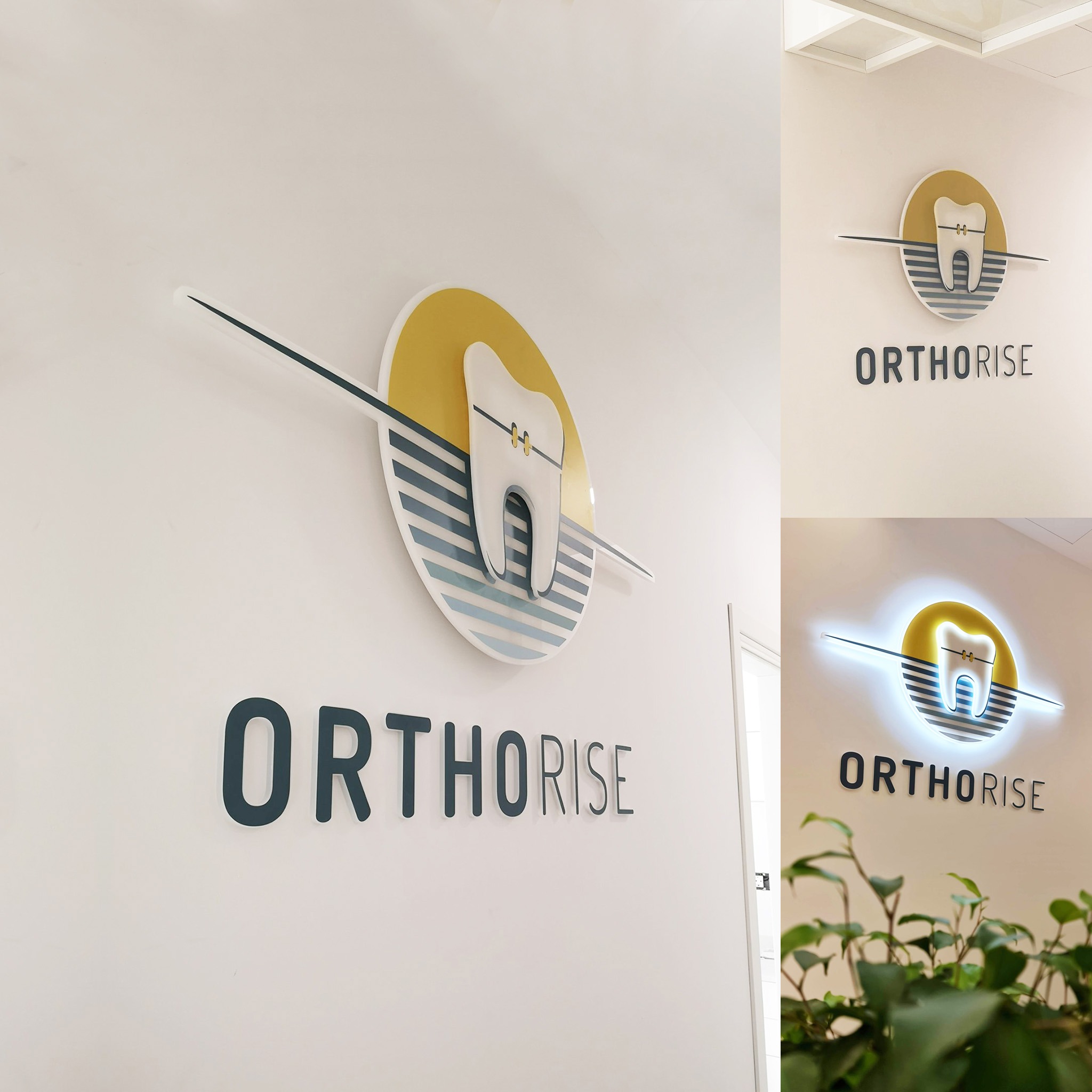
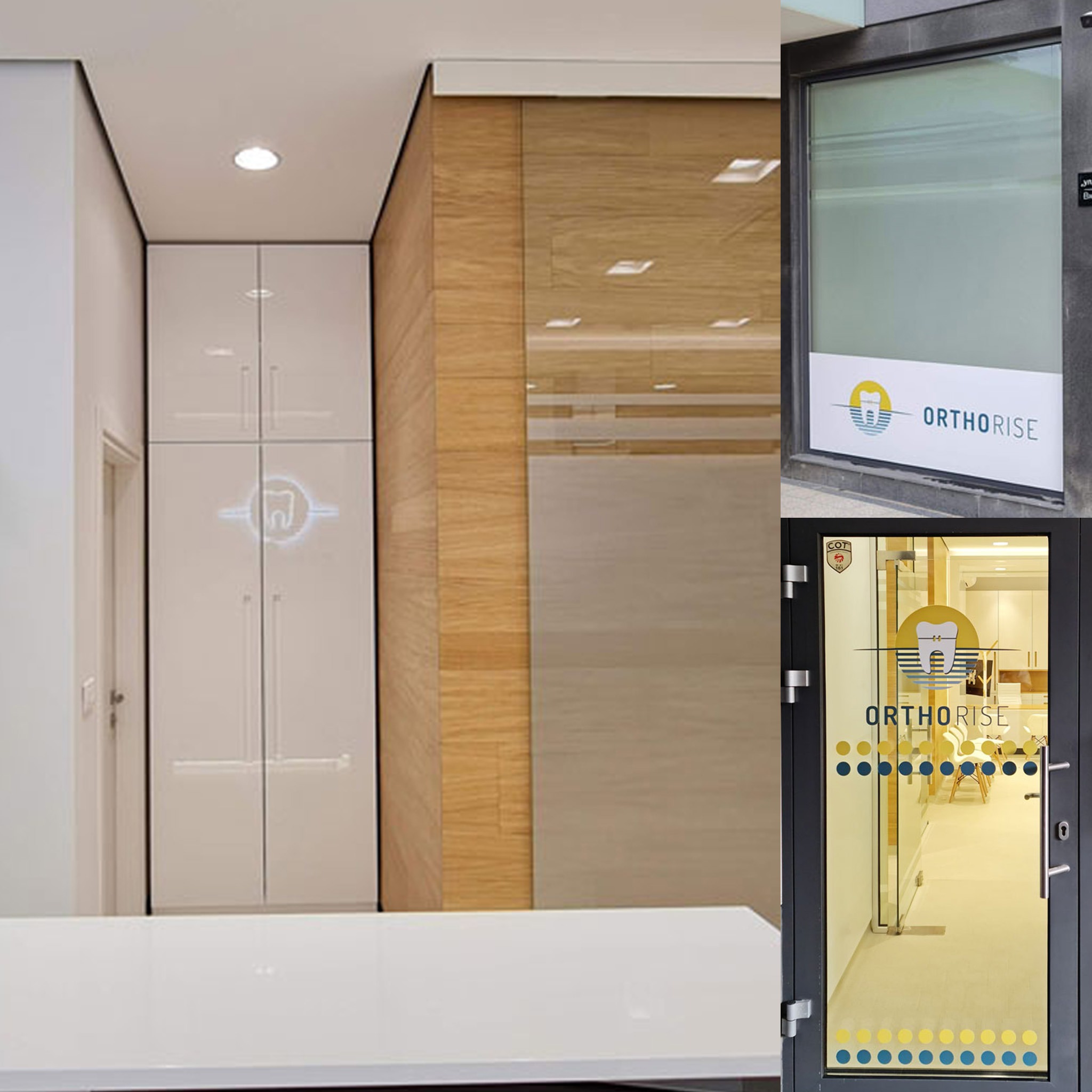
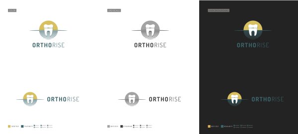
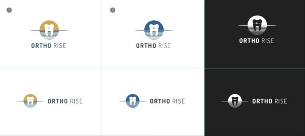
The branding challenge came with a clear and specific brief: to create a visual identity rooted in orthodontic symbolism, incorporating a stylized tooth and bracket: instantly recognizable and clinically relevant. The logo had to work seamlessly across digital platforms, print, and dimensional applications for both the interior and exterior of the clinic.
As the creative process unfolded, the idea of a sunrise naturally emerged as a powerful visual metaphor for transformation, optimism, and a fresh start. That concept became central to the final mark: a tooth with a single golden bracket rises over a horizon of clean structured lines, balancing warmth with clinical precision. The typography supports this with a modern, confident tone.
I have to give special thanks to APRA Design for turning my vision into reality with such razor-sharp precision that it looks like a render. Only it isn’t!