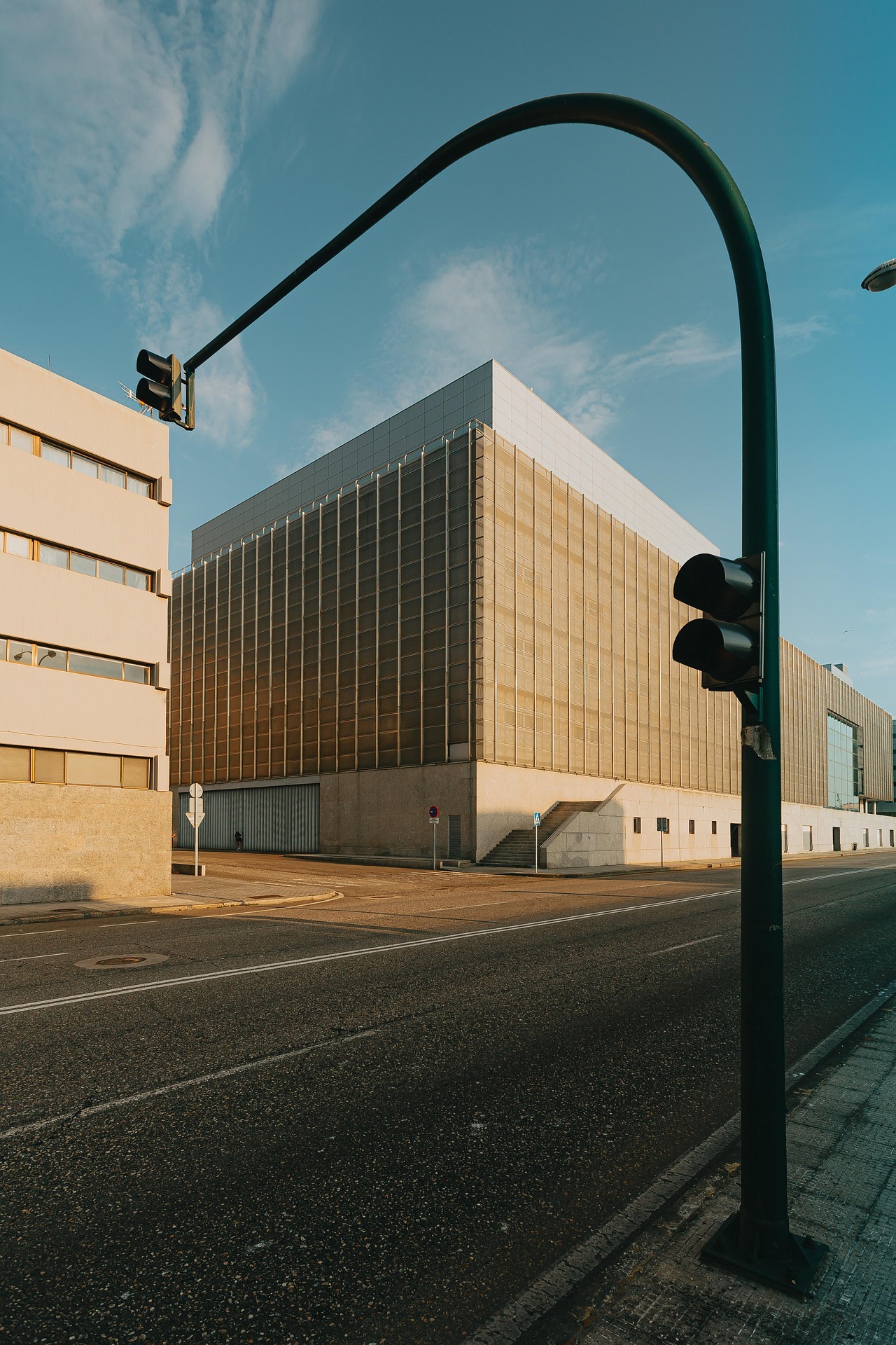
The Return of the Shadow
Softness, Substance, and the Things We Overlook
There was a time when shadows in UI felt like a craft. Back in the skeuomorphic era, they helped things feel real — like you could reach out and press something.
They weren’t just decoration. They took time. We’d adjust softness, light direction, layering — all to make sure things felt grounded and believable.
Now shadows are easy. Quick to add, quick to forget.
On a project a while ago, I was working on the main navigation and — almost without thinking — I added soft shadows underneath. They looked good, gave a bit of depth, so I moved on.
But when I came back to it the next day, it was obvious: they didn’t belong. The layout didn’t need them. They were just... there.
And I remember asking myself — why did I even add them in the first place? From that point on, I made it a habit: always check the shadows. Especially when they seem invisible.
Because even when they’re subtle, they shape how things feel.
Especially when working with colored elements, it's easy to forget that shadows aren’t just gray. In the real world, they carry color — warmth from a red shape, cool tones from a blue surface. Light bounces. Shadows pick up what’s around them.
So when we drop a flat, neutral shadow under something vivid — even something small — it can feel off. Like the object isn’t part of the scene, just floating above it.
Our eyes are tuned to this, even if we don’t notice it consciously. We feel when light behaves naturally — and when it doesn’t.
So now, whether it’s a card, a button, or a piece of key art, I take a second look. Do the shadows make sense? Are they grounded? Are they earning their place?
Because when you spend some time on your shadows — it shows.
