Logo Design: Formats, Scalability, and Today's Essentials
Sunny Sunday afternoon, sipping a coffee with a friend. She is starting a new endeavor, so we discussed the logo she is working on. And in detail: the actual formats that are the norm today. And this brings me to this thought: What is the standard today? What has changed in recent years?
What Is a Logo, and Why Does It Matter?
A logo isn’t just a symbol or a piece of art. It’s the visual anchor of your brand. The first thing people see, the mark they remember, and the shorthand for what you stand for. But here’s the key: A logo is much more about function than looks. It needs to work across every platform, size, and context where your brand exists and successfully convey information.
That’s why a logo should never be designed in isolation. It must be part of your brand strategy, shaped by real-world demands: Where will it live? Screens, print, or both? How will it scale? From a 16px favicon to a billboard? What formats does it need? Static, animated, or adaptive?
Notice: This post focuses on the technical and practical requirements of modern logos: formats, flexibility, and functionality. (The emotional, messaging, accessibility layers? That’s a whole other conversation.) The text also assumes the reader already knows principles of logo design - at a basic level, taught anywhere in the industry for decades.
Before You Even Think About Formats or Flexibility
Check your concept first. It has to be simple enough to recognize instantly. Skip the trends, it’ll look dated in a year. It has to stand out without being confusing. If it blends in with competitors, it’s not doing its job. Get these essentials right first. No amount of adaptability can fix a bad concept that doesn’t lay the groundwork correctly.
Digital First
Today, logos live mostly on screens. The print-first logo isn’t dead, but if most of a company’s touchpoints are on a screen, you absolutely need to go digital-first.
But what does "digital-first" actually mean?
The Basics
The shape needs to have a clear silhouette and easy-to-read lines. While these are basic design principles, you have to be doubly careful with logos. The design will appear on all kinds of displays: different screen qualities, resolutions, and contrasts.
What we’ve gained in recent years is the ability to use gradients and smaller fonts in digital versions. While you still need to be careful with print, digital logos allow for more flexibility.
Icon Version: A Must-Have
Having an icon format is basically a must. Phones, social networks, and website favicons require an icon version. If you have a logo with a horizontal layout, for example, and slap the full logo on a social network, no one will read the text.
This icon can also be used effectively in print for small formats and branding all sorts of items. Just having it ready opens up a lot of options.
Note: You can design different versions of your icon depending on pixel size. Icons below 64px don’t need as much detail, for example, and you can improve legibility by reducing complexity. Another bonus of this approach is the reduced file size of the smaller icon. Every kilobyte saved means faster loading for your actual content online.
SVG: The Main Version, Not a Side Show
Years ago, PNGs ruled the world. Now, they’re mostly used for fallback scenarios (like email, due to security issues with SVG files).
Today, your logo should be in SVG format by default. SVGs are vector and resolution-independent, meaning they look sharp at any size, from a tiny favicon to a massive billboard. They’re also lightweight, which helps with load times, and they support transparency and interactivity*, making them ideal for modern digital experiences.
*Interactivity still has limited browser support.
PDFs remain the safest choice for print - they’re widely compatible and maintain all vector/color data intact.
How to Approach Logo Preparation
Based on these considerations, I’ve devised three tiers of work and detail for logos, depending on the project’s size, budget, and timeframe. A startup testing the waters usually can’t afford the time and budget an established brand with a refined strategy can. These tiers help you focus on what truly matters, without overcomplicating or underdelivering.
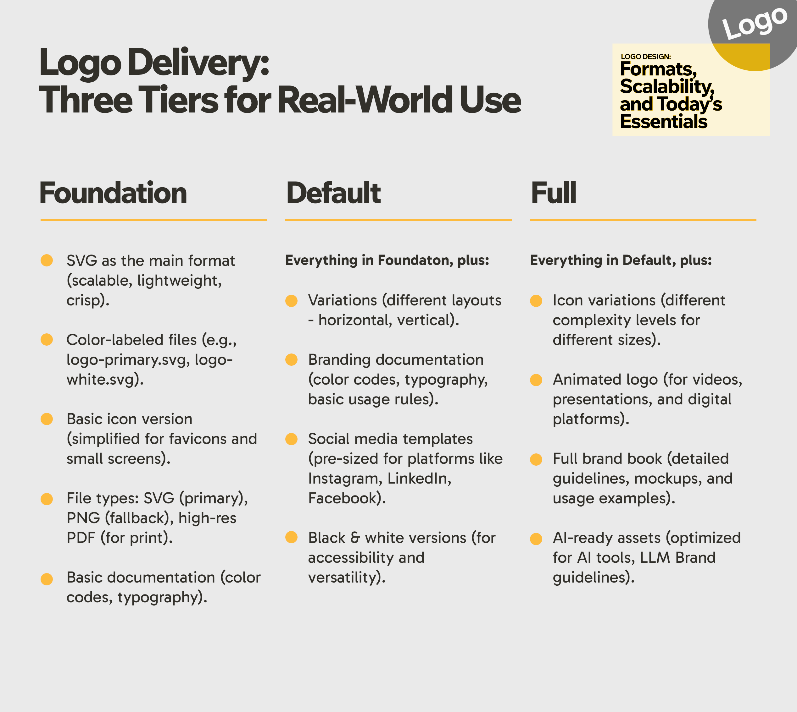
Logo Delivery: Three Tiers for Real-World Use
1. Foundation
The lean foundation. Ideal for startups, side projects, or tight timelines, this tier covers the essentials: a finalized logo in key formats and a primary font. Think of it as the minimum viable brand. Just enough to launch, but designed to scale later.
- SVG as the main format (scalable, lightweight, crisp).
- Color-labeled files (e.g., logo-primary.svg, logo-white.svg).
- Basic icon version (simplified for favicons and small screens).
- File types: SVG (primary), PNG (fallback), high-res PDF (for print).
- Basic documentation (color codes, typography).
2. Default
The standard for growing businesses. This tier includes everything in Foundation, plus icon variations, basic brand guidelines, and social-ready assets. Enough to keep a marketing team aligned without overcomplicating the process. Perfect for companies ready to build recognition but not yet investing in full-scale branding.
Everything in Foundation, plus:
- Variations (different layouts - horizontal, vertical).
- Branding documentation (color codes, typography, basic usage rules).
- Social media templates (pre-sized for platforms like Instagram, LinkedIn, Facebook).
- Black & white versions (for accessibility and versatility).
3. Full
The comprehensive system for established brands. This tier includes animated logos, full brand guidelines, and everything needed for global consistency, long-term adaptability, and third-party use. Ideal for companies treating their logo as a strategic asset, not just a visual mark. Think of it as future-proofing your brand identity.
Everything in Default, plus:
- Icon variations (different complexity levels for different sizes).
- Animated logo (for videos, presentations, and digital platforms).
- Full brand book (detailed guidelines, mockups, and usage examples).
- AI-ready assets (optimized for AI tools, LLM Brand guidelines).
+ Options: Additional Flexibility
Depending on your industry or channel needs, you might require additional options. A few examples:
- Movie Studio or Entertainment Industry: Advanced animations in different formats (e.g., MP4, GIF, Lottie) for video surfaces.
- Tech Startups: Interactive logos or dynamic versions for apps and websites.
- Retail or Fashion Brands: Packaging-specific adaptations, fabric-friendly versions, or holographic designs.
The AI in the Room
I don’t recommend using AI image generation to create a logo for a few reasons:
- Most AI tools generate raster images. You’ll need to trace and vectorize them afterward, which defeats the purpose of using AI for speed.
- Fonts are a nightmare. AI often distorts or misrenders typography, leading to legal issues or unreadable text.
- Lack of originality. AI-generated logos risk looking generic or accidentally similar to existing brands.
If you’re experimenting with AI, use it for ideation; it’s great there. But always validate, refine, and finalize the design into an actual deliverable.
Final Thoughts
So in summary, this has changed: SVGs replaced PNGs as the default format, icons became non-negotiable for digital touchpoints, and AI tools entered the conversation; though with major caveats.
Today, the difference between a logo that serves its purpose well and one that does it greatly often comes down to how well it adapts. Scaling down to a favicon or standing out on a billboard.
P.S. I hope this helps anyone designing a brand, a logo, or looking for an insight on how to plan it (including my friend).
Now back to my designs. The sunny afternoon has faded into memory, replaced by the quiet rhythm of rain and the slow fall of leaves across the autumn ground.
