ID Design Patterns: How to Make Them Work for Users
Another "UX improvement" post pops up on my feed. Not the first, not the last. Some of them spark inspiration, others make me cringe. But lately, I’ve noticed a pattern: so many of these examples feature an ID: order numbers, ticket IDs, tracking codes - just sitting there as plain, unremarkable text. These essential building blocks of characters are often at the heart of critical user flows, yet are treated like an afterthought.
I’ve been turning this over in my mind for a while. Watching how people interact with them. Noticing the friction. Wondering why something so essential gets so little attention.
I guess this is the moment I finally decided to put it into words. If there’s one thing in UX that’s quietly begging for more thought, it’s the humble ID. It just took me a while to see it clearly.
Function Over Form
This isn’t about visual design. It’s about how IDs work in real-world use cases. Are users copying them? Scanning them? Tracking transactions? The same ID can serve different purposes depending on context.
Before redesigning, ask: How are users interacting with IDs? Do they need to see the full ID, or just copy it? Are they under time pressure? Function dictates design.
Warning: Never assume. A small change like hiding an ID or removing a copy button could break a critical workflow. Understand the use case first!
Note: This exploration focuses on core functional patterns, but there’s a deeper layer of edge cases: user urgency, data security, cross-platform consistency, and more. Those are worth exploring, but for now, we’re zeroing in on the fundamentals: making IDs work better in everyday interactions.
Functional Patterns
I’ve explored four different ways to handle IDs (A,B,C,D), focusing on usability and efficiency. The goal? To make IDs work better.
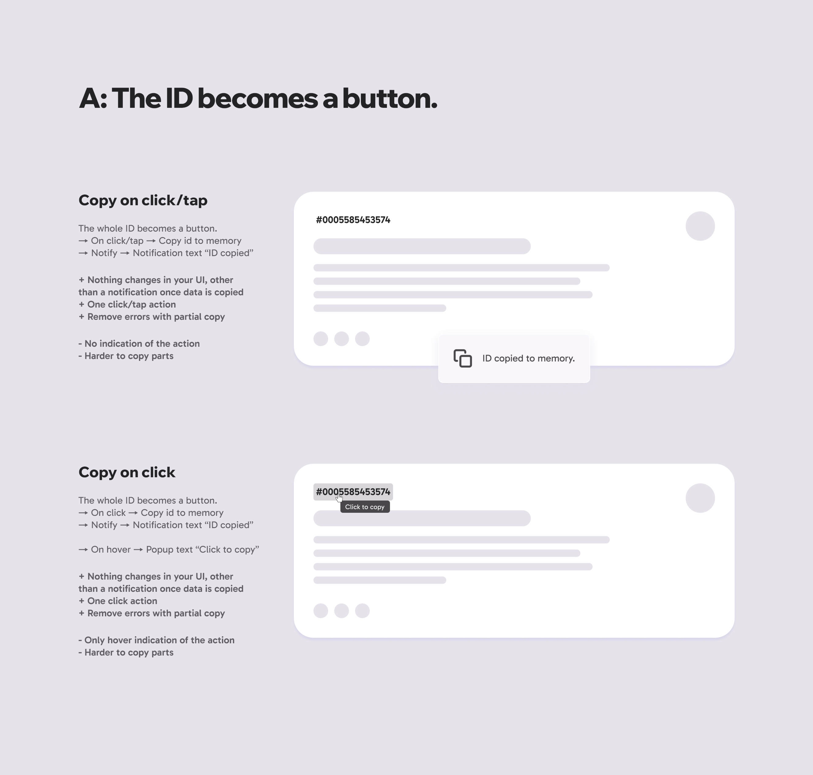
A: The ID becomes a button.
Use this when: Simplicity and speed are your top priorities.
The simplest approach: let users click or tap the ID to copy it instantly.
This pattern is ideal for interfaces where users need to copy IDs frequently but predictably. It’s the least intrusive option: no extra buttons, no hidden menus, just a direct action on the ID itself.
Key insight: This is the "just work" solution. No big changes to the UI, no clutter, but it trades flexibility for speed.
Copy on Click/Tap
How it works - mouse & touch:
→ On click/tap → Copy ID to memory
→ Notify → Notification text “ID copied”
+ Pros:
- Nothing changes in your UI, other than a notification once data is copied.
- One click/tap action.
- Removes errors with partial copy.
- Cons:
- No indication of the action unless you hover or tap.
- Harder to copy parts of the ID.
Copy on Click
How it works - mouse:
→ On click → Copy id to memory
→ Notify → Notification text “ID copied”
→ On hover → Popup text “Click to copy”
+ Pros:
- Nothing changes in your UI, other than a notification once data is copied
- One click action
- Remove errors with partial copy
- Cons:
- Only hover indication of the action
- Harder to copy parts
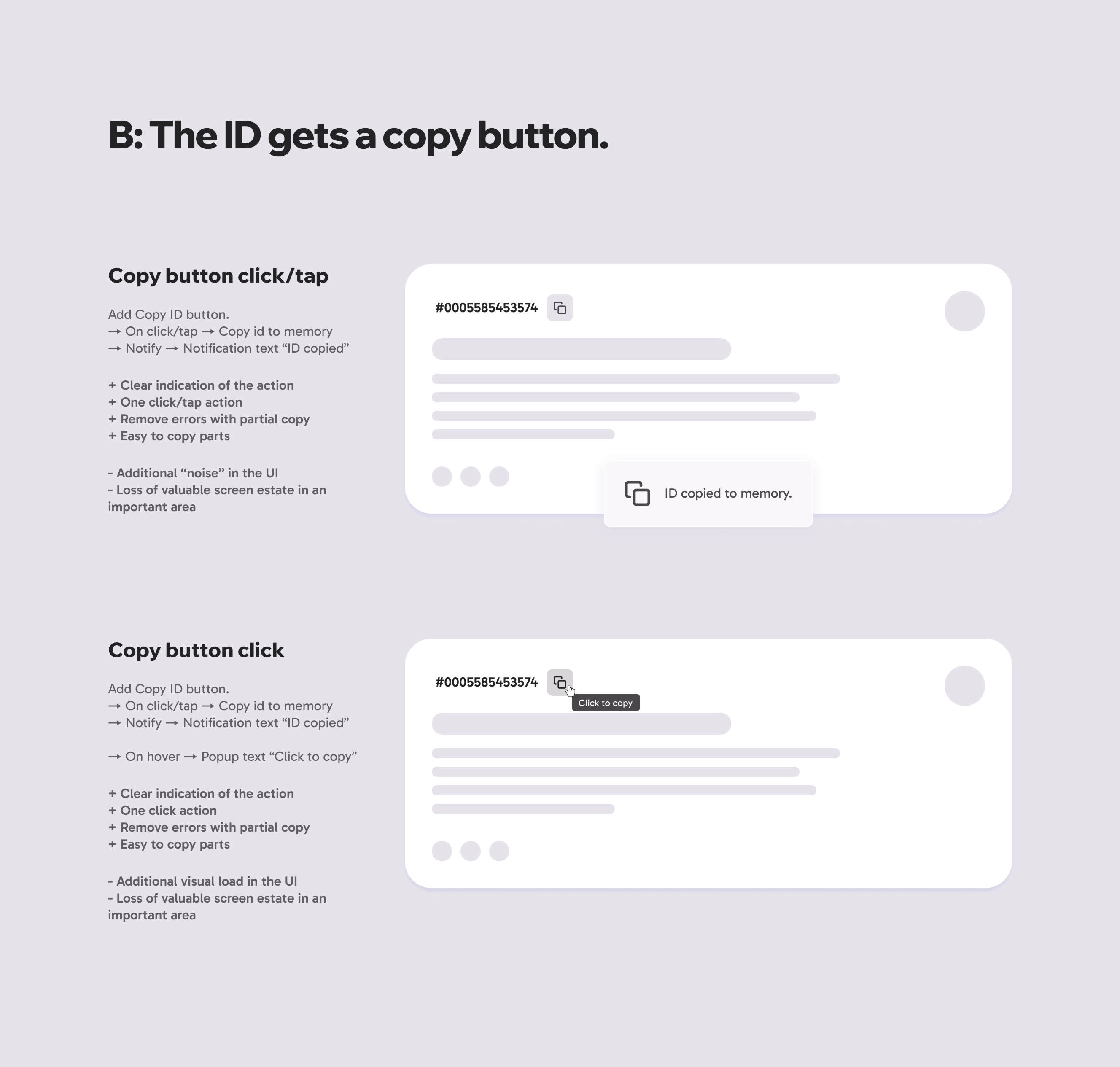
B: Additional Copy Button.
Use this when: Clarity and confidence are more important than minimalism.
Add a dedicated "Copy" button next to the ID for explicit action.
This pattern adds a dedicated "Copy" button next to the ID, making the action explicit and immediately obvious. It’s the right choice when users need reassurance. Unlike the subtle click-to-copy approach, this leaves no room for doubt: "Yes, this is how you copy it."
Key insight: It’s a small addition to the UI, but it eliminates guesswork. The trade-off? A bit more visual noise. But when the goal is reliability over speed, this pattern delivers.
Copy on Click/Tap
How it works - mouse & touch:
→ On click/tap → Copy ID to memory
→ Notify → Notification text “ID copied”
+ Pros:
- Clear indication of the action.
- One click/tap action.
- Removes errors with partial copy.
- Easy to copy parts of the ID.
- Cons:
- Additional “noise” in the UI.
- Loss of valuable screen estate in an important area.
Copy on Click
How it works - mouse:
→ On click → Copy id to memory
→ Notify → Notification text “ID copied”
→ On hover → Popup text “Click to copy”
+ Pros:
- Nothing changes in your UI, other than a notification once data is copied
- One click action
- Remove errors with partial copy
- Cons:
- Only hover indication of the action
- Harder to copy parts
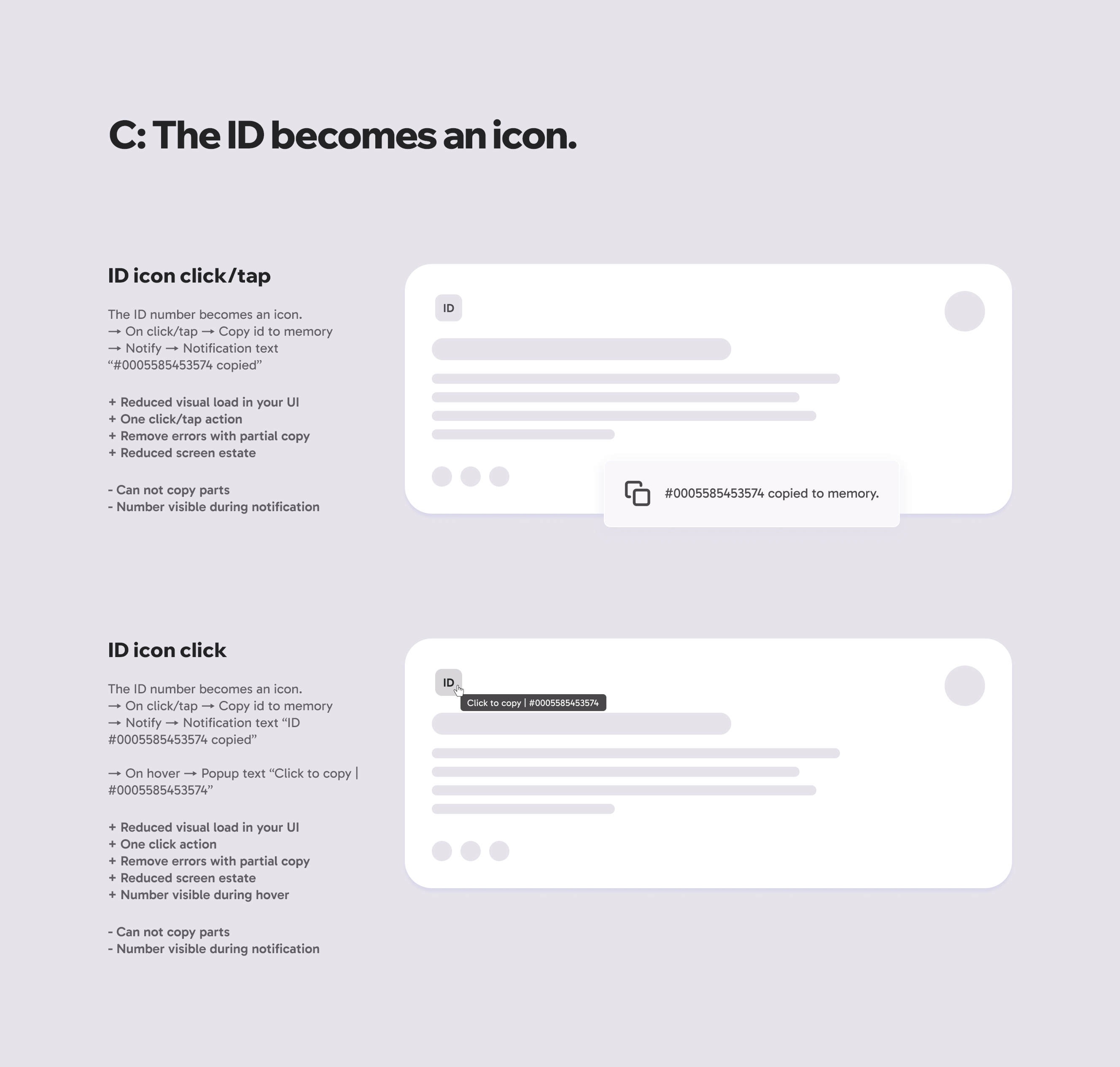
C: The ID Becomes an Icon.
Use this when: Space is limited, and visual simplicity is key.
The ID number becomes an icon for a cleaner UI.
This pattern replaces the full ID text with a compact icon (e.g., a document symbol or hashtag), reducing clutter while keeping the copy function intact. It’s best for interfaces where screen real estate is precious - think mobile apps, dense dashboards, or secondary panels. The ID itself only appears briefly (on hover or after copying), keeping the UI clean but functional.
Key insight: This is the minimalist’s choice, sacrificing immediate visibility for a tidier layout. The trade-off? Users must trust the icon’s meaning (so pair it with a clear tooltip or notification). Perfect when you need to de-emphasize the ID without removing its utility.
ID Icon Click/Tap
How it works - mouse & touch:
→ On click/tap → Copy ID to memory
→ Notify → Notification text “#0005585453574 copied”
+ Pros:
- Reduced visual load in your UI.
- One click/tap action.
- Removes errors with partial copy.
- Reduced screen estate.
- Cons:
- Cannot copy parts of the ID.
- Number is only visible during notification.
ID Icon Click
How it works - mouse:
→ On click/tap → Copy ID to memory
→ Notify → Notification text “ID #0005585453574 copied”
→ On hover → Popup text “Click to copy | #0005585453574”
+ Pros:
- Reduced visual load in your UI.
- One click action.
- Removes errors with partial copy.
- Reduced screen estate.
- Number visible during hover.
- Cons:
- Cannot copy parts of the ID.
- Number visible during notification.
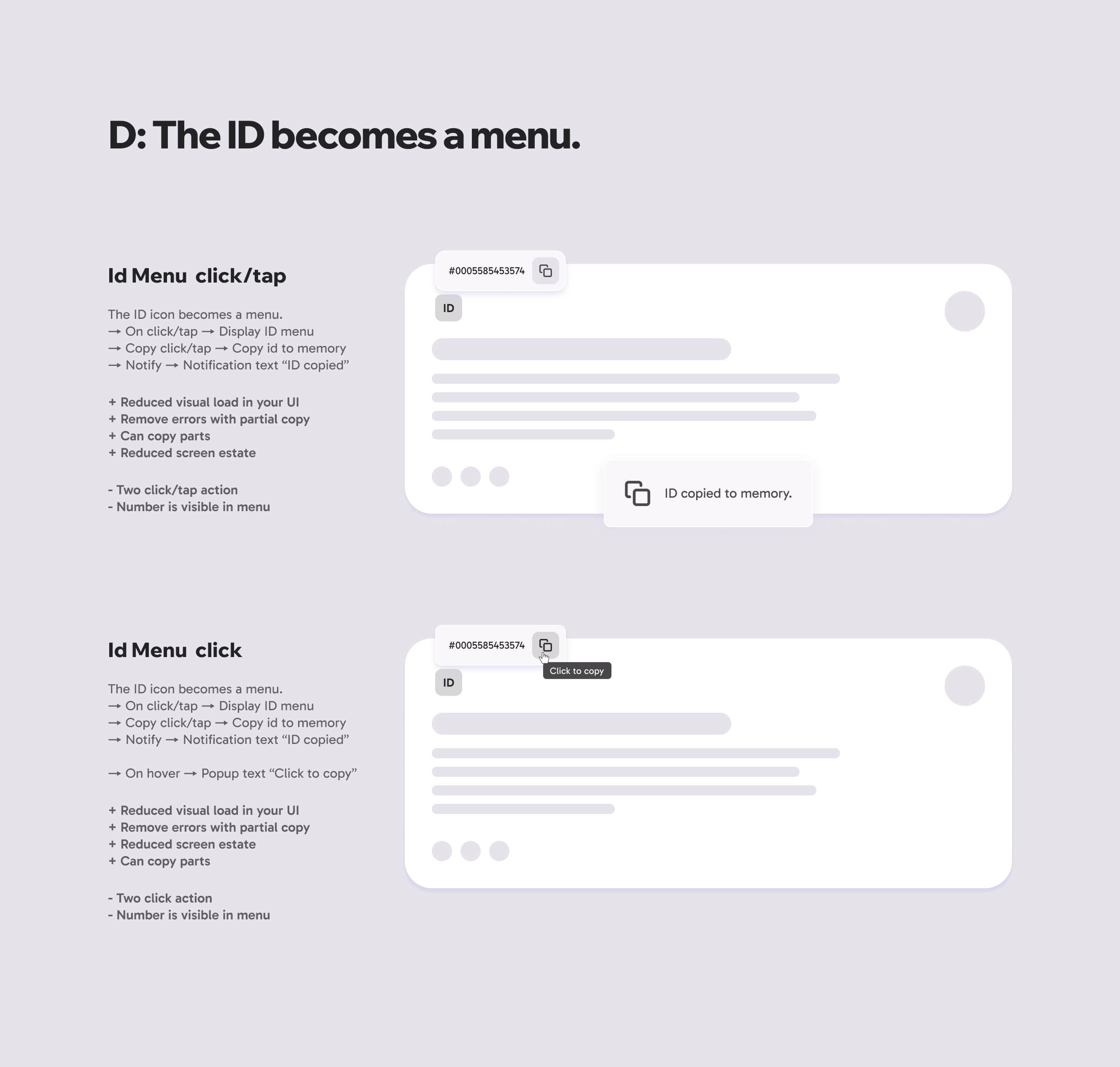
D: The ID Becomes a menu.
Use this when: Flexibility and additional actions are needed beyond just copying.
The ID icon becomes a menu for more options.
This pattern turns the ID into a dropdown or context menu, offering copying, and a platform for additional features like sharing, or viewing details. It’s ideal for complex workflows where users might need to interact with the ID in multiple ways. The menu keeps the UI clean while providing more control when needed.
Key insight: This is the most versatile but also the most interactive option. The trade-off? It requires an extra click to access the ID, which might slow down frequent users. Best for scenarios where context and options matter more than instant access.
ID Menu Click/Tap
How it works - mouse & touch:
→ On click/tap → Display ID menu
→ Copy button click/tap → Copy ID to memory
→ Notify → Notification text “ID copied”
+Pros:
- Reduced visual load in your UI.
- Removes errors with partial copy.
- Can copy parts of the ID.
- Reduced screen estate.
- Cons:
- Two click/tap actions.
- Number is first visible in the menu.
ID Menu Click
How it works - mouse:
→ On click/tap → Display ID menu
→ Copy button click/tap → Copy ID to memory
→ Notify → Notification text “ID copied”
→ On hover → Popup text “Click to copy”
+ Pros:
- Reduced visual load in your UI.
- Removes errors with partial copy.
- Reduced screen estate.
- Can copy parts of the ID.
- Cons:
- Two click actions.
- Number is first visible in the menu.
P.S. "If I’m being honest, I didn’t expect to spend this much time thinking about IDs. But once I started noticing how often they go unnoticed - it became clear they deserve more attention. I’ve put off posting other things these last few weeks to dig into this, hoping it might help someone else staring at an ID in the app or software they’re designing. If it does, then it was worth it.
Now back to staring at my own designs: IDs and all. "
