The Minimum Viable Brand: Avoid Costly Rebrands by Starting Right
The "Fix It Later" Trap
It was a sunny winter afternoon. I was leaving a store when I spotted it again: a mid-size company headquarters with a logo that screamed "we'll fix it later." The company had clearly grown (the building was impressive and expensive looking) but their branding hadn't kept up. That artistic, spindly font? It might have seemed clever on a laptop screen five years ago, but on a physical sign, it was lost in the glare and looked like a bad joke next to the beautiful construction.
Every time I see this, the designer instinct kicks in. It’s that old obsession. The same one that makes me double-check shadows to ensure they feel "grounded." I just want to walk in and explain that their outside doesn't match their inside.
That company with the spindly font? They're now paying the hidden tax I'll describe next - the cost of "we'll fix it later."
Branding is an Evolution, Not a Destination
I often see companies paralyzed by the idea that a brand needs to be perfect to launch. It doesn't. It just needs to be functional.
I call this the Minimum Viable Brand (MVB). In my previous notes on logo delivery, I referred to this as the "Foundation" tier. It isn't about cutting corners; it's about establishing the load-bearing walls. An MVB establishes just enough structure to communicate the benefits of the brand without creating technical debt.
The Hidden Cost of "Good Enough"
You might think, "We'll fix the visuals when we have more budget." But "we'll fix it later" is not a plan. It is a tax on your future self.
It's not just about aesthetics; it's about the "disconnect." We feel it when light behaves unnaturally in a UI, and we feel it when a company's visual identity contradicts its competence. If your delivery is solid but your brand looks amateurish, the client experiences friction. They hesitate. They question.
This is where the designer actually steps in. It isn't just about making things look "nice." The true value of the field is definition and Visual Translation. If your core message promises "precision" and "reliability," but your visual spacing is sloppy, the customer receives a mixed signal. A designer's job is to ensure that the visual elements accurately carry that core message. It's about ensuring the "part" (the logo) speaks the exact same language as the "whole" (the company).
Evolution vs. Excavation
Now, marketing wisdom says a brand shouldn't sit still. It needs to evolve to stay relevant. And that's true: visuals should shift as the company and market shift, but there is a massive difference between evolving a brand and rescuing one.
If you start with the solid foundation of an MVB, changes are natural updates, like adding the finishing touches to a painting. But if you start from a bad position - with pixelated files, a logo that can't scale or worse, one that carries a confusing message - rebranding isn't an evolution. It's an excavation.
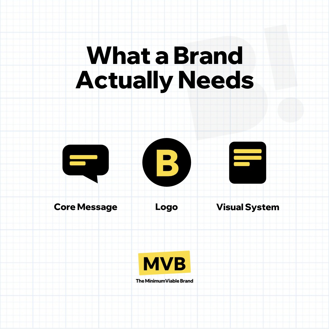
What a Brand Actually Needs
So what does a brand actually need? Three functional pillars:
A Core Message That Works Now Forget the tagline. You need one sentence that answers the basics:
What do you do?
Who is it for?
Why does it matter?
This does double duty: it clarifies value and ensures your visuals have a clear target to aim for.
A Logo Built for Digital Reality A logo isn't just a piece of art; it is a functional asset. For the MVB, you don't need a 50-page brand book. You need technical rigidity:
A Logo: The visual anchor that translates the company's core message.
The Icon Requirement: This is non-negotiable. If you slap a horizontal text logo into a square social profile or a 16px browser tab, it disappears. You need a simplified symbol version immediately.
SVG as Default: PNGs are for fallbacks. Your primary logo must be an SVG to remain crisp from a favicon to a billboard.
A Simple Visual System Avoid the temptation of custom illustrations or complex visuals for now.
Choose one Primary Font that is legible.
Select 2-3 Core Colors tested for contrast on screens.
Put those with the logo and core message in a One-Page Guide.
You Still Need a Pilot in the AI Plane
A critical blind spot in this "move fast" approach is the temptation to turn entirely to AI generators.
The nuance is this: AI tools are incredible accelerators for ideation, but for the load-bearing walls of your brand, a professional is still required.
A seasoned designer might indeed use AI in the process, but the workflow is fundamentally different. The Novice accepts the AI output as the final result, usually receiving a single, high-fidelity raster image. The fatal flaw reveals itself the moment this "universal image" leaves the preview window.
It is easy to assume that one logo file can do it all. But when forced into the microscopic reality of a 16px browser favicon, a mobile app header, or a QR code, the physics of display take over. The subtle gradients turn into mud. The "clever" text details dissolve into unreadable noise. They are trying to fit a complex painting into a keyhole.
The Professional, by contrast, understands that a brand needs optical sizing, not just resizing. They use the AI output only as a sketch. Then, they reconstruct and evolve the concept to work in all kinds of formats, channels, or specific niche requirements.
But beyond the pixels, they are protecting that Visual Translation we talked about earlier. They ensure that when the logo shrinks, it doesn't just stay readable; it stays honest to the core message. They guarantee that the "precision" you promised doesn't turn into "clutter" just because the canvas got smaller. They ensure the brand survives the shrink.
I'm currently putting these principles into practice across three distinct projects. One is a fresh launch, where we're setting the foundation from the first brick. The other two are established brands reaching an inflection point - successful companies that have outgrown their original visual shells and are ready to align their identity with their actual competence. Soon I will have the example here - as a validation of the concept.
Final Thoughts
I've watched too many companies waste months cleaning up preventable messes. Nothing undermines credibility faster than a rushed, pixelated logo sitting next to a competitor's perfect identity. And I've personally seen the damage when a new competitor who does grasp the concepts behind the MVB principle enters a slow-moving niche: their sharp, reliable identity wreaks havoc, instantly making the established noise look obsolete.
The MVB isn't about perfection. It's about starting prepared, making sure that when you eventually do grow, you aren't held back by the decisions you made on day one.
P.S. The sun has set, and the winter chill is settling in. I still want to improve every brand I see on the street. I guess that's the curse of this calling. But for now, I'll settle for writing this down, hoping it saves someone else from the "fix it later" headache... or some colleague the "brand excavation" exercise.
Check back in a few weeks for the MVBs of the three brands if have found in the concept interesting.
